Table of Contents
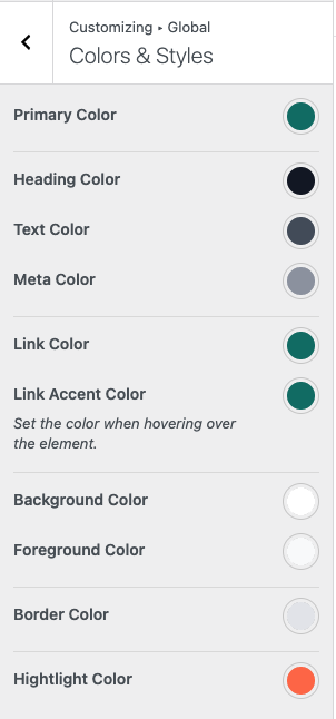
The theme provides global color settings that are applied consistently across the entire website.
Color Options #
- Primary Color – The main brand color, commonly used for badges, hover backgrounds, and highlights.
- Heading Color – Applied to headings (H1–H6) and labels.
- Text Color – Used for general text and content.
- Link Color – The default color for links.
- Link Accent Color – Applied when hovering over links.
- Background Color – The main background color of the website.
- Foreground Color – Used for content areas, cards, and surface elements.
- Border Color – Applied to borders and dividers.
- Highlight Color – Used for cart tooltips and important UI highlights.
Where to Configure #
You can manage global color settings from: Appearance → Customize → Global → Color & Style